
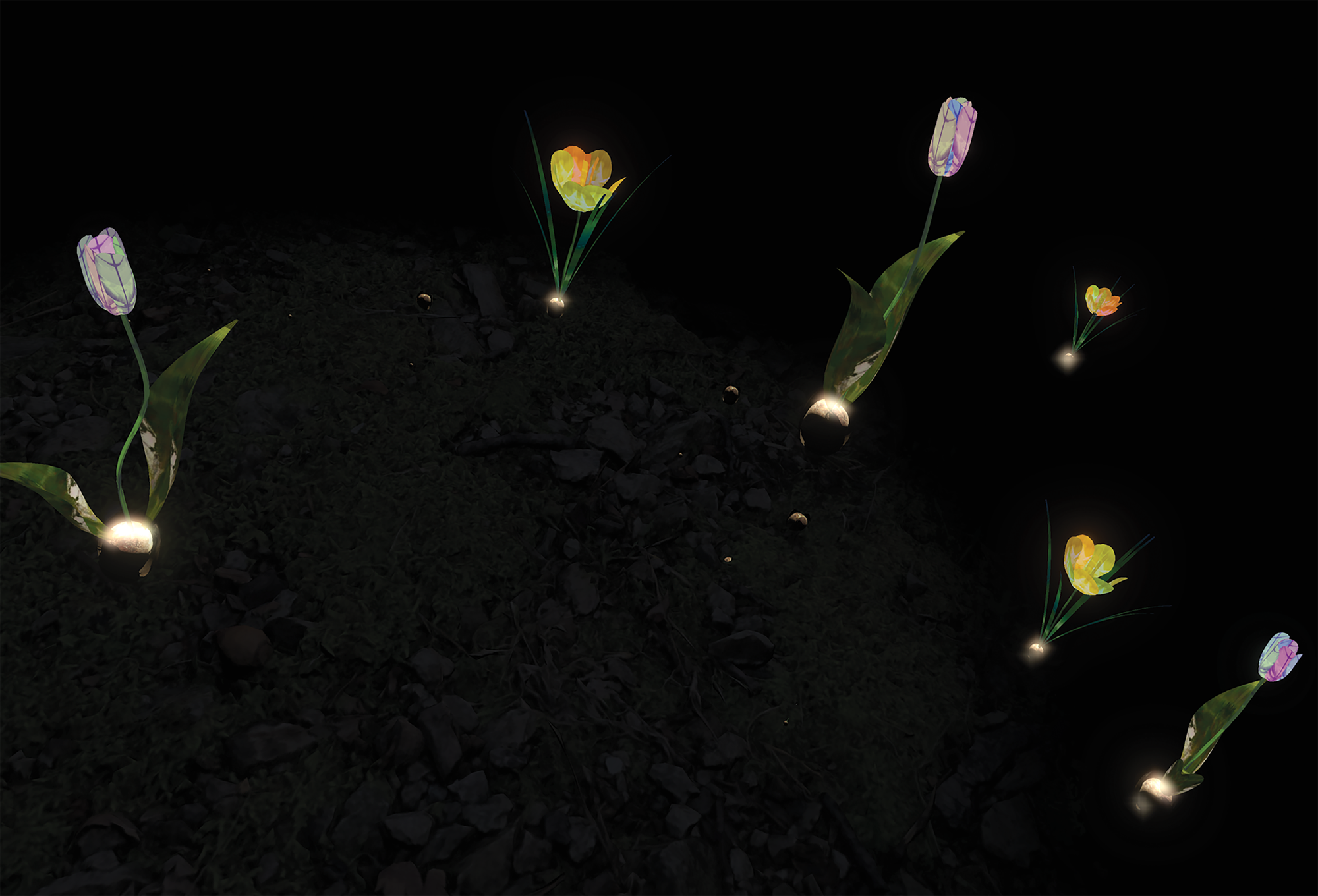
Cemetery flowers in “Dark Spring” | Photo courtesy of Katherine Parsons
Out of the darkness, bright tulips bloom.
Others wilt and whither.
In “Dark Spring,” Digital Art Professor Katherine Parsons’ art project, she explores how cemetery flowers reflect both life and death. This VR experience for Coaxial Arts in downtown Los Angeles focuses on the relationship between light and dark in a digital context.
“That tension between the dark and the light, and when we can kind of play with that and explore that a little bit –– that’s when you kind of feel the value of both,” Parsons said.
Cemetery flowers in “Dark Spring” | Photo courtesy of Katherine Parsons
Parsons uses cemetery flowers specifically to show fleeting happiness, as the flowers only live for a short time.
“I think I’m really drawn to [darkness] because without that, the light doesn’t mean anything,” Parsons said. “You don’t have that contrast. You have to go through this darkness in order to appreciate the light.”
Light and dark are such essential elements of art that the Italians created a word for it: chiaroscuro. Each artist uses light, dark, black, white, shadow and contrast as tools in his or her creative wheelhouse.
Artistic ‘value’
The relative lightness or darkness of a color is referred to as its ‘value.’
“If you think about color, it has three components,” Art Professor Shanna Waddell Colbert said. “It has value, lightness and darkness, and temperature … So when you talk about lightness and darkness, every color in the world has that in it.”
Some artists use grayscale to show the depth of variance between the lightest and darkest shades.
“I think the important lesson about dark and light is the gray of it,” said Gretchen D. Batcheller, professor of studio art in painting and drawing. “The mix of it is the phrase, ‘We’re ever-evolving and we’re ever-changing.'”
The combination of the two extreme values shows that darkness has a scale. Batcheller said that although her students are sometimes timid when using darkness, it is essential to make colors come alive.
“If there aren’t enough lightest lights and darkest darks, then a painting can look really anemic,” Batcheller said. “It can seem really colorless even though there’s a lot of color, but the moment you get the dark values in there, then it begins to live in the piece.”
Complete contrast
Some artists limit their color palette to just black and white.
While exploring topics for her senior portfolio, Jane Yi, computer science and digital arts major, concentrated on black-and-white movement pieces, avoiding the grays. Yi’s pieces look like film negatives. They are videos of Bible verses on dark pages with illuminated white characters.


Photos courtesy of Jane Yi
“I was exploring my [Korean and Christian] identity and wanted to include it in my art and celebrate the language itself — the characters and the details of it,” Yi said.
Yi said she recalled discussing with a professor how the ghostly images are both eerie and beautiful.
“I noticed that the negative effect seems a little bit scary and haunting,” Yi said.
Yi compared her work to the descriptions of angels in the Bible, who inspired both terror and awe. Yi said she thought about adding grays to her work to enhance this effect.
“I just wanted to keep the focus on the subjects in my productions, which might be the texture, might be the Bible or me,” Yi said. “There was a quality about having that contrast between light and dark [that] pulled me in, [and] I was hoping visitors would experience the same effect. I didn’t want to take away from it because grays and colors can help highlight certain things.”
Shifting perspective
Light and dark can change the focal point of a piece.
“When you’re making a painting, you use a lot of lightness and darkness to create contrast, and it creates more interest for you to then move around to find focal points,” Waddell said.
Dark and light guide Waddell’s focal points in her work, as she is very intentional about the colors she uses and their value. The bright colors show the primary concepts, while the dark points highlight elements not seen at first glance.
Waddell paints dark concepts in colorful settings with darkness surrounding them to highlight their negative qualities. For example, she paints Satan in bright colors but uses darker details to cast a spotlight on sin and show how it can be bright and attractive.
“We are often seduced by sin or darkness in the world,” Waddell said. “From afar it’s very colorful and then it slowly starts to reveal itself.”
_________________________________________________________________
Email Ali Levens: ali.levens@pepperdine.edu
Email Emily Morton: emily.morton@pepperdine.edu