
Transparency Item: The views expressed in this article are the opinion of the writers.
There are 32 teams in the National Football League. It’s been this way since the 2002 season, when the Houston Texans joined the party and the league realigned into two conferences of 16 teams each. Those 32 teams carry with them their own histories, their own fanbases, their own identities.
And, of course, their own logos.
But, this is not a democracy — not all 32 NFL logos are created equal. Some stand out, some fade into obscurity and some are just downright weird.
Two intrepid members of the Graphic staff — Sports Assistant Editor Alec Matulka and Special Edition Editor Ali Levens — decided it was time to get to the bottom of this whole shebang. Who has the best logo in the NFL? Who cracks the top five? Who languishes at the bottom, in the ninth ring of proverbial graphic-design hell?
As with all art, the answer is obviously not subjective. Let the logo picking commence!
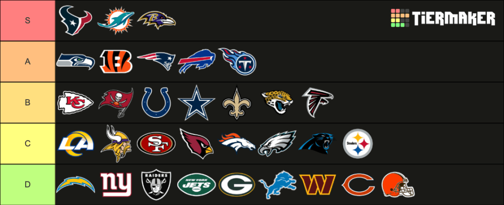
Alec’s Picks
Graphic by Alec Matulka
There were a number of factors in my methodology for this ranking — mainly creativity, recognizability and color.
To begin with creativity, I wanted to reward logos that emphasize unique visuals over alphanumeric symbols. This is why the Washington Commanders, New York Giants, Green Bay Packers and Chicago Bears fade into the D tier. Below them is the New York Jets, who inexplicably decided to spell out their entire name on a simple green background.
The only thing worse than that would be if a team, I don’t know, decided to use a standard football helmet as their logo. But, no team would do that, right?
The San Francisco 49ers, Kansas City Chiefs and Los Angeles Rams suffer for a similar reason — they rely too heavily on letters. As they tell you in writing courses, “show us, don’t tell us.” Paint me a vivid picture of who you are as a team, don’t just spell it out.
I have put the Seattle Seahawks in the top five. Full transparency: I am from Seattle, Wash., so my feelings may be a bit biased on this matter. But, I like its sharp lines and its subtle yet effective blue, green and gray color scheme. The Miami Dolphins are a no-brainer at number four — who doesn’t love seeing a dolphin?
Here’s where my picks get a bit contentious.
The New Orleans Saints logo is bold, it’s bright and it’s iconic. You see it on T-shirts or banners or hats and you know who and what it represents. It’s simple and iconic like the Dallas Cowboys logo, yet it’s got some flare too. Plus, the French influence of the fleur-de-lis helps evoke the city’s history.
The Denver Broncos logo is used by thousands of middle-school athletics programs across the country, and there’s a reason why. It’s provocative — it evokes a field of horses running through an open plain. The orange mane is a fun streak of color, while the design of the neck illustrates this is a horse on the brink of exhaustion. It’s giving everything it has got, and I respect that.
The Tennessee Titans‘ logo takes the number one spot for me. The colors alone make this one pop — I’m a sucker for that red-blue contrast. It stands out — I can’t name another logo that looks quite like it. With a team name as abstract as ‘Titans,’ they’ve gone with something equally provocative as a visual.
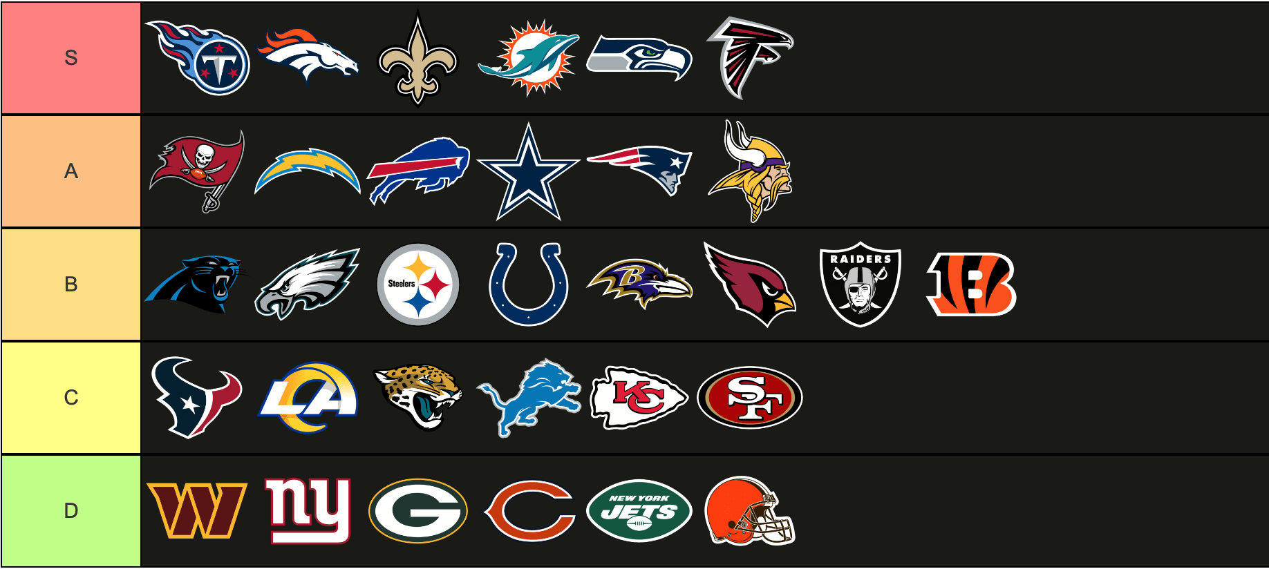
Ali’s Picks

Graphic by Ali Levens
This process taught me I am a stone-cold logo hater.
A mere three teams eclipsed the sought-after S tier. The Texans, Dolphins and Baltimore Ravens knew what they were doing with their logos. These all go above and beyond to show the outside world the team name in an appealing manner.
The A tier logos were close to S tier. Alas, they do not cut it, but are still very strong logos. B tier logos are meh. They are recognizable and cool, but if I had to buy merchandise with these logos on them, I would opt for a t-shirt with the team name written in Bebas Neue font.
C tier logos are mid. I am tired of all these animals simply looking to the side with a menacing look on their faces. Where’s the spice? Where’s the multi-billion dollar marketing budget going?
Last and certainly least are the whopping nine team logos rotting in D tier. How dare these teams even show their logos to our eyes? All of these logos are upsetting to look at — and before you come at me with the “Oh, it’s a classic logo,” I do not want to hear it. Classic does not mean good.
The majority of these teams have so much material and history to work with, so I have no sympathy for these teams who choose to live in denial about their crappy logos. There are ways to have a retro and classic look while effectively and creatively demonstrating the team name.
There is one exception to this and that is the 1964 Detroit Lions logo. Bring this genius design back, and it will immediately go to S tier.
I am not open to criticism about my list— only compliments and affirmations.
__________________
Follow the Graphic on Twitter: @PeppGraphic
Email Alec Matulka: alec.matulka@pepperdine.edu
Email Ali Levens: ali.levens@pepperdine.edu